Letting go of a great love

The things we remember.

April 7, 2007

I was 21, living my best life. I was going to a bar opening downtown. An acquaintance in my friend group was dating a guy who managed trendy night clubs. We would spend the evening in the VIP section, drinking signature drinks on the house, made with the new Absolut Pear vodka.

I was more of a bonfire socialite, but I dressed in all black hoping to fit in with a chic crowd. I met our group at the mansion a friend had recently inherited. Our cab driver showed up shortly after. 

I remember being crammed in the back seat. The cab driver made a joke about my buddy’s name, shaking a giant box of Mike and Ikes.

I don’t remember if I had fun at the club. I probably spent a majority of the evening smoking cigarettes outside with one of two friends I was pursuing at the time. I mostly remember that I never had the desire to drink that pear vodka again.

After the club, I convinced my host to strip down to his skivvies with me and do 2 hours worth of dishes that had piled up in his bachelor pad kitchen. He had been going through a hard time.

I woke up fully clothed on the living room couch buried under about 13 winter coats. It was Easter Sunday. I was late. I drove a couple miles south to my Aunt’s house. My brother and cousin were sprawled on the couch. The three of us spent two hours sending nonsensical texts to a girl in her science class. 

I remember the white wristband from the club was still on my wrist and it must have been obvious I hadn’t been home to shower. My parents hardly spoke to me and they left the event shortly after brunch. I awkwardly slunk out at that point as well.

I phoned a friend who was spending the holiday all alone. I went home and showered and he picked me up to go to a movie. We procrastinated in the movie theater parking lot and decided to get a newspaper to browse movie times before we completely abandoned the idea. As soon as I got the paper, I habitually opened to the classified section. My buddy and I casually looked over the puppies for sale as I gushed about my lifelong dream to get a Yorkie.

We spotted a listing for a mutt and my buddy convinced me to call the number. An older woman answered and, despite it being a holiday, she invited us to take a look. We drove an hour to her farm and passed stacks of animal cages on the way to her front door. 

When I saw him, he was a fluffy brown ball in the bottom of a cardboard box. My friend held him first. I don’t remember first holding him, but I remember observing his adorableness as he interacted with the other people in the room. He was perfect.

“How firm are you on $350?”


April 12, 2020

I was 34, living the dream. I had an adorable son, with a little girl on the way. I had a great job, a supportive husband, and a beautiful home in my favorite city in the world. 

I appreciated everything I had, including my two sweet dogs. The little one, Bentley, had been with me all through my twenties and well into my thirties: through moves, breakups, hangovers, layoffs, depressions, and eventually finding my way. 

fam

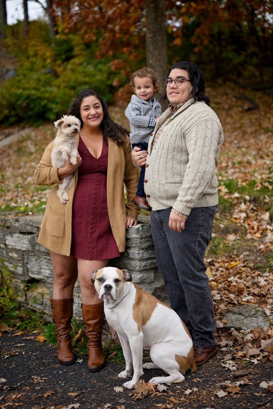
Family photo, currently 1 week pregnant with baby #2

He never minded a selfish act or a misjudgement of character. Bentley didn’t complain it had been too long between groomings or that we were behind on his shots. He was perfectly accommodating for all my flaws as a pet owner.

But things had turned sour at some point. We had to confine Bentley to the first floor, the designated dog area of the house. He was no longer allowed on the furniture, a major shift from the 10 years he spent sleeping with me in bed and cuddling on my lap on the couch. He didn’t have a good view of the outdoors, but spent the entire day and most of the night barking at random sounds from outside the house. He snapped at any visitors or family members who disturbed him. I had actually forgotten who my puppy had been, until our last day together.

We planned Bentley’s final rest for Easter Sunday. In the morning, we gave him his favorite most obnoxious toys to play with. I cuddled him, telling him how important he was. I thanked him for always being exactly what I needed and for being my family for thirteen long years. He knew something was wrong and hid in the pantry until it was time to leave the house.

dogs

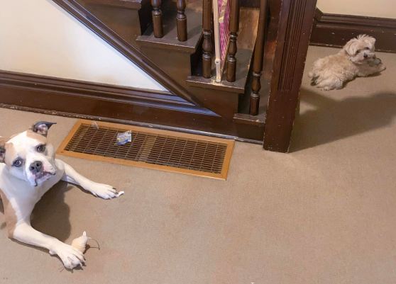
Our dogs, playing on Easter Sunday, 2020

I promised myself to stay strong. Bentley always knew something was wrong when I cried. He would climb up to lick the tears off my face. I held my composure, secure in my decision.

Clinic staff greeted us at the car and escorted me to the check-in area. This was during a global pandemic, with a social distancing ordinance in place, so I went into the clinic alone, leaving my family in the car. I struggled on a disposable mask and gloves while Bentley studied the lobby nervously. 

I played with him in our room until the technician brought him away to get him set up to receive an injection. I dried an escaping tear before he came back in the room; he was a tiny statue on a plush blanket.

He looked so tranquil and well behaved in the vet’s arms. I was so proud of the good dog he had become. I was so lucky to have this perfect friend-roommate-baby. The vet explained the process to me in a gentle and concerned tone. “I’m sorry, but my mask just will not stay on.”

I hadn’t noticed, but her nostrils were completely exposed. The mask elastic drooped from her ears, flopping as she shook her head in a defeated way. I don’t know why the whole scenario made me laugh so hard. I was laughing alone and before I knew it, about 35 tears streamed down my face. I regained my composure for Bentley’s sake.

I held him awkwardly and spoke to him with a shaky voice, telling him I loved him and that everything was going to be good again. I can’t remember if I was able to say everything I wanted. There is no way that is even possible in such a short time. When I left, I knew what I had done could never be undone. I knew I had lost a treasure. 

All the feelings of comfort and love he brought me over the years came flooding back. Letting him lick my mouth, carrying him around in the crook of my arm for stretches of hours. How my heart filled with warmth when he ran to me after we had been apart. The most raw, unwavering love I had ever felt and never known existed until I had a human child.

mems

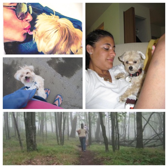
Countless memories with Bentley

I received a card from the vet today, expressing their condolences. I almost felt sorry for myself, but it’s hard to feel anything but guilt and regret for the decision I made. I wonder if that will change one day. I don’t feel like I deserve relief from this sadness because I chose this for my family.

The house is quiet now and we are all sad a part of our family is missing. The last remaining piece of my life from before everything finally became good is now just a memory. And now, Bentley only lives in my collection of demented, fragmented memories where I will cuddle him forever.

collage

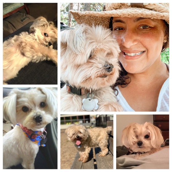
My sweet Bentley, in recent years


Chris Milk The Creator Project

How technology can make user experience more human

I discovered Chris Milk while I was walking home from work yesterday when I stumbled upon his TEDtalks video in my podcast feed.

In the video, Chris Milk describes his recent work to develop interactive experiences that incorporate elements of spacial reality to configure a screen that feels less like a screen and more like a window into another person’s life. He describes the powerful effects of interactive facial tracking navigation and 3D sounds and visuals that allow a user to feel a story and open a new inquiry for user experiences.

I couldn’t find his Evel Knievel video at first, but I was finally able to see Chris Milk’s production unite Pamela Anderson, Kanye West, and Curtis Mayfield. I followed the Milk trail until I arrived to the http://ro.me project. (It was worth switching to Chrome.)

I am so excited to find such an interesting visionary, and also someone that shares my same views on the rhetorical aspects of user experience in multimodal communication. I know how impactful a poem can read on paper, but I’ve experience something different when a poet reads it out loud. What is so powerful in that visceral register? Sound, smell, touch, or is it something metaphysical? Movies can set our emotions on fire with sound and picture, but what frames our perceptions of those experiences of sounds and lights is what ultimately revs us up.

I am excited to see what Chris Milk has up his sleeve for WebGL and I hope this technology can alter our current trajectory into apathy.

My Closet Room

How to justify being totally obsessed with clothes

Trying to figure out why I spend most of my disposable income (and sometimes a bit of my not-so-disposable income) on fashion.

I am so obsessed that I even watch videos of shoppers unpacking their own shopping bags to get a contact high from their purchases. I eat, sleep, and breathe outfit ideas, However I have the most fun sifting through the clothes that other people discard.

At first, I worried my addiction to thrifting was a character flaw. I believed I was trying to fill a void in my life by accumulating things I didn’t need. I thought I spent money in an effort to suppress an inferiority complex that had something to do with living in a lower socioeconomic bracket. I thought that if I could spend a little effort searching I could spend a fraction of the full price for an item that I might have missed during its season.

I took a break from thrift stores for a short time. But I found myself put off by department stores and conventional clothing retailers. I couldn’t visualize myself wearing the clothing on the racks or on the mannequins. Carrying an armload to the fitting room, I always felt the dread that my garments weren’t designed for me. I mean, why would they put my size at the end of the spectrum? It seemed like all the items in their collection were designed, priced, and marketed for someone else.

Obsessed with clothes, online shipping: Consumer ReviewsI found some comfort in online shopping. I could search by  garment characteristics that most of my clothes shared. Strangely, not being able to try clothes on never posed a problem, because clothing items come with detailed descriptions and (usually) hundreds of consumer reviews.

I discovered how much I trusted clothing more when I knew someone else had purchased, tested, and approved it first. Clothes are artifacts of our civilization, and the rhetoric surrounding clothing pieces can be suffocating. I felt suffocated by the branding of clothing in conventional retail stores; and the mannequins’ empty faces emphasized the clothing’s alienating feel. It was impossible to visualize a garment after a wash or two or to imagine how it might crease around my joints at the end of the day.

I also felt the clothes I picked in department stores were picked for the wrong reasons. Maybe it looked good on the mannequin or in comparison to the rest of the collection. It could have been one of the more affordable items in the store. Sometimes I would buy clothing retail and then feel dwarfed by the brand—How is that style?

But the thrift store is a living, breathing collection of clothes. Someone brought this item into their home, and then shared their days with it. Some clothing is decades old: an embodiment of the materials, trends, and technology of its native era. Some clothing is timeless, a good design with evergreen fashion appeal. During my field research, I am learning evergreen fashion appeal is somewhat of an illusion, because clothing manufacturers will always tailor craftsmanship of staple items to fit current industry trends that change minutely with every season’s production.

I love exploring the other sections of a thrift store too. Nowhere else can you see what people use every day in their own homes. It’s an excavation of regretted purchases and discarded favoritesand usually the function and designs don’t really make a lot of sense. But it will make sense to whomever will purchase it second-hand and it made sense to whomever first took it out of the packaging. It also made sense to its designer, maker, marketer, and distributor. It’s amazing to see an item at this point in its product lifecycle, and to see its physical characteristics frozen in time and out of place.

New clothes still represent all the creative and economic thought and manpower that dedicated people put into them, but it’s just too hard for me to see past the marketing and branding to appreciate it. So now I am finally able to admit that I am obsessed with clothes. And I would rather sift through a grab bag of culture than envy a mannequin. Any day.

Life after Writing Class

Hey You,

I finished WRIT 4662W Writing with Digital Technologies, so I will be posting new ideas prompted from my day to day life going forward. I am in a period of transition and I hope to channel some reflection into this blog.

  • Develop my ideas
  • Help people in a similar mindset
  • Better understand where I’ve been and where I’m going

I am nearing the end of my final semester at the University. I am working on campus and my two courses are project based. Let me know if you are interested in my projects or how I am searching for THE BIG CAREER.

I have been planning a new healthy lifestyle while my boyfriend plans to buy a house. I’ve been reflecting today about how we’ve both changed so much since we met in 2013. Instead of feeling disappointed or overwhelmed, I am feeling very grateful for the happy things I have in my life today.

In my Technical Writing & Communication studies, I’ve learned that content and design are interrelated in technical and web writing. Even though I had to learn this concept in Visual Rhetoric, Web Development, Writing with Digital Technologies, Science Writing for Popular Audiences, and Writing on Issues in Science and Technology; I learned this concept long ago: In poetry, where user experience and look & feel  were always first considered.

I believe the moments before something amazing happens, you usually have no idea that it’s coming. I wrote this poem to remind myself that marvelous things will happen, and to remember the best year[-to-date] of my life.

Comment below and let me know what you’d like to read about for my future posts!

Beginner’s Guide to Using Scalar.usc.edu

Hello Friends!

I have been using Scalar to create pages, paths and tags for an interactive project on wearable technology. This has been quite a time-consuming process, so I’ve decided to keep my concepts simple to use scalar for my project.

I want to share the process to upload and embed a video from YouTube into a page.

This is a rather simple task, but a major affordance of this medium, so it’s important to use and understand this functionality. I have included photos I’ve annotated using an App for Macintosh.

This slideshow requires JavaScript.

I hope you enjoyed my experience with Scalar. Be sure to check out the final product!

https://ideaobrien.files.wordpress.com/2014/11/world-usability-day-2014.jpg

How to Engage an Audience on World Usability Day

University of Minnesota’s event to promote engagement in user-centered design

On November 13, 2014, technologists, designers and digital curators from various disciplines met to promote awareness of the benefits of usability engineering and a user-centered design. World Usability Day. I was scheduled by my employer to stick around all day on-hand if they needed help.

OpenTwinCities

The Introduction was Bill Bushey and Laura Andersen from OpenTwinCities. These two told a tale of an organization’s journey from a two-guy “hack-a-thon” to a national movement of their own and other grass roots civic technology groups.

Their mission is to engage people in the community to participate and discuss civic issues, using technology and individuals as resources. Co-founder Bill Bushey explained the best way to invite engagement is to hold an event, and how communities are best with open government, open internet, with open technology.

Laura Andersen talked about the importance recognizing everyone as a skilled individual and the process of creation: prototype, test, iterate. I was most engaged when she talked about an Un-Conference when the discussion is participant-driven. She said that new things come together from different contributions, she joked, “Nobody knows what they’re doing.”

Panel Discussion

The next presentation was a Panel discussion. Panelists from American Public Media (for MPR), AtTask (consulting comapny), Macalester College, and the U of M discussed their roles within their companies. They all discussed the need to have meaningful conversations to enable people to do wise actions.

Each of the panelists engaged users and clients by offering information designed to hook, sustain and advocate. They also argued that engagement is not an action but a design; and the biggest job of a facilitator of engagement is to stay out of the way.

The Nerdery

My favorite presenter was Matt Edwards, Senior User Experience Designer at The Nerdery. Edwards delivered a silly but interesting presentation about methods for data analysis and synthesis. He used the allegorical paradigm of the Hero’s journey (aka the Monomyth) to describe a way to develop a user-experience strategy. He used an on-going analogy of Star Wars to demonstrate a way to examine a user’s experience in parts (analysis).

I found this comparison silly but logical. After all, there aren’t many possibilities for plot outside:

  1. Hero in ordinary world, establishing what is normal
  2. A call to adventure
  3. Refusal of the call
  4. Meeting the Mentor
  5. Crossing the threshold/ meeting threshold guardians
  6. Test, allies, enemies and shape-shifters
  7. The approach, the climax, the cave
  8. The ordeal, which is the furthest point from “normal world”
  9. The reward
  10. The road back
  11. The resurrection
  12. Return with elixir, deeper thing in addition to the reward that is found along the way

Edwards used this Monomyth to illustrate opportunities for engagement, drawing parallels between parts of a user’s experiences and plot elements. He was able to see places where a user did not have access to vital outcomes or tools.

He explained his idea for feature development, diagramming various parts of a users’s experience using channels, stages, and expectations. This is his method for synthesis. I found this extremely helpful to conceptualize my class project for LSS.

Synthesizing a persona’s journey through LSS’s website as an allegory helped me see how we can tie different pieces of content into a meaningful arrangement. We should plan navigation as Edwards recommends: a clear flow of NEED, SEARCH, FIND, CHANGE to keep the conversation going through all four service offerings until a client finds the right foster program for their situation.

How to add professional contacts to a Personal Learning Network (PLN)

Professional Learning Network (A. O'Brien 2014)

Professional Learning Network (A. O’Brien 2014)

Hello!

I found a new mind mapping tool for my second Personal Learning Network. I discovered a great resource for different brainstorm and mindmap tools. I  stopped at number nine, Bubbl.us. It was actually the first tool I checked out, unfortunately I can’t really tell you about any others. I plan to try a new tool again for my third PLN; not to say I didn’t like Bubbl.us.

Content wise, This time around I feel more comfortable listing people I haven’t known  very long. I looked up contacts for my new position working with CLA, and I added undergrads from my classes. It was nice to separate my professional contacts by industry; because before I had people from very different professional backgrounds crowded all together.

The tool was very easy to use–I didn’t Google, seek embedded help, or flounder once in the couple hours I spent working on this. BUT- It was tedious to consider aesthetics. My colors are arbitrarily assigned, and most of the child bubbles are pined haphazardly in a frustrated attempt to move the shapes.

Usability wise, I never really got the hang of the curser-bubble techniques to move, connect or add child bubbles. Although that didn’t stop me from one-by-one colorizing and sizing my connections. Every. Single. One. Well, actually… the orange Restaurant Connections were a default color, and some of the child bubbles would change color to match their parent(?) bubble. I may have been exaggerating a bit.

I hope you check out the tool. It’s great to chart interconnected mindaps.

How to manage web content as a subcontractor

Beginning web content management for a Non-Profit Organization: Audience Analysis

Hello Friends!

I hope you’ve had an opportunity to learn about Lutheran Social Services of Minnesota (LSS). They’ve organized services to help families, youth and people with disabilities since 1865.

Our writing class is working with this organization to help manage their website’s content for four lines of service. Our class divided into groups, and my group is developing a revision for LSS Host Homes for Adults with Disabilities.

My group is very fortunate to have so much content to work with, but we are still taking this assignment very seriously. We’ve been analyzing the site’s audience to determine what type of content can deliver the message LSS desires.

Our goal is to encourage people to become Host Home providers. Our design should provide enough information to let viewers make an informed decision to get involved, and most importantly, create a site they can find and use. We began the creative process with a little science…

Audience analysis was fun and heartwarming. We reached out to current Host Home providers and interviewed them about what motivated them to become involved. We asked many questions and no two interviews were the same. After our group gathered normative knowledge on the service, we compiled the data into three deliverables: Personas, a Vignette and a Frequently Asked Questions list.

Our group used these audience analysis tools to guide which pieces of content to include on the site. This gave us an idea about which details were most relevant at the beginning stages of becoming a Host Home provider. We gathered all the LSS pages related to our line of business and made a content analysis chart.

Screen Shot 2014-10-22 at 11.33.18 PM

Content Analysis Chart

Finally, we made a preliminary site map to give a brief, visual representation of the pieces of content and provide a simplistic view of how they relate to one another. We are still working on our first draft of the site map, but I’ll share the preliminary map so you can get an idea.

Site Map

Preliminary Site Map

So far, we are feeling very fortunate to have such great contacts to gather first-hand accounts of the Host Home experience. We are also thankful for the abundant amount of content on the LSS website, which is also very organized. The audience analysis and the content analysis do identify a couple areas we want to improve: search engine optimization (SEO), cutting down to essential messages, considerations for which content comes first, and moving the conversation ahead through related links.

The last point about moving the conversation ahead through related links is a topic I discussed with my classmate, Christina. Her group is working to develop content for Host Homes for Youth Experiencing Homelessness. We were thinking about possibly linking our pages. Maybe a kind person wants to open their heart and their home to help, but they want to explore LSS services before making a decision about which service to choose?

These are all ideas we’re holding on to. For now, we have our hands full of links and headings…

Please comment below if you would like to know more, or if you have a good suggestion for my group’s project.

How to use basic web building to make information beautiful

How I used HTML to improve my blog posts on WordPress

Hello friends!

Thank you for checking on my site. Today I want to share a couple examples of my recent experiments with my blogs. We’ve been learning about basic HTML coding for web writing and my assignment is to use code-writing to adjust some of my web content.

Luckily, I’ve been revising my blogs this entire time.

Unfortunately, I hadn’t been documenting the changes.

Fortunately, WordPress is prepared to help someone as indecisive as myself, and there are ways to see every single edit and version made since creation of a blog post.

I want to show you a couple examples of the changes I made to two of my blogs. I added a header, added typeface color, floated a media image, added a margin to that image, and adjusted the dimensions of a photo to correct the stretched faces. Take a look!

Before- PLN

First Draft- Awkward image/text positioning with crowding

The first version shows the PLN media image first thing in the post. Immediately, without a space, the text begins at the bottom of the image.

What you cannot see from the picture, is that the photo is not linked to the media file, so if a reader clicked on the image, a small image of the PLN (The same size displayed) is the largest viewable option.

After- PLN

Current Version After Code-Edits: margin, border and padding, also float next to text

I changed the blog post a couple days after a lecture from Professor Joe Moses taught my class how to code a couple tricks with images.

Professor Moses taught us the difference between padding and margins and how to float an image next to the text. He also showed how to add color. I got a little help to code this revision from a great resource: www.w3schools.com.

The best part about this website is that there are embedded sample boxes that you can practice and view the changes as you change the code.

My next example is for my visual analysis for CRS. For this, the changes may be subtle to some. This was actually my first attempt to change the font color, and I changed it simply by coding the word “maroon”, eerily intuitive!

CRS- Before

Before width/height correction, before header established

I also noticed I hadn’t made this vital information searchable via search engines because it was not being recognized as a header. I changed it to h1, and I was able to go through the rest of the blog to format the other headings to the “strong” formatting previously assigned to the now header.

How the code changed from version to version.Code- CRS

After- CRS

Current Version- Adjusted Header/Photo

During class, Professor Moses cringed at the sight of my distorted photographs. He advised me to forgo the lecture on floating and fix the dimensions. It was actually kind of funny he was so disturbed by something I made a conscious choice to overlook.

As soon as I had some spare time, I fixed the dimensions by guess and check, comparing my distorted images to the BuzzFeed website where I retrieved them.

I hope my story inspires you to take a little extra time and make your information more beautiful!

How to use an infographic to make information beautiful

How to Create an Infographic

Blog 5

Today’s blog post is my choice. I chose to create an infographic. This was inspired by my classmate, Colin’s blog. Although, I feel slightly embarrassed my graphics and content aren’t quite as professional as his. This serves as good practice for my infographic Visual Rhetoric assignment I have coming up.

This infograph was created using Piktochart. It was easy to learn this software and there are lots of examples of layouts you can either pay for or use for ideas to create your own template (my choice). The tool is so intuitive, I didn’t troubleshoot a single tutorial or use the help features. There were lots of graphics to choose from (far more than template options) and lots of customize-ability. The concept of blocks, used by this tool, is a good concept to grasp for web design; I would recommend this tool to any person interested in learning to create professional-looking graphics or infographs. I can imagine this tool can be used for a number of projects in addition to infographs.

I have actually tried to recruit lost undergrads into the S&TC program. I have to remind myself that, for them, it may not be love at first sight like it was for me. I wholeheartedly love learning about human factors and usability, rhetoric, semiotics, semantics, writing theory, and writing using digital technologies. Sometimes I think I was missing something in my life before acknowledging my passion for information architecture. It’s also rewarding to encounter achievable tasks and accessible ideas outside my knowledge base/comfort zone. I am very thankful for the opportunity to become a professional in a field I respect and enjoy to this extent. It’s also fun to see others as excited as myself, hence the nerd reference…

How to avoid Facebook Philanthropy: “Liking Isn’t Helping” Campaign

“Liking isn’t Helping” A Visual Rhetorical Analysis

Crisis Relief Singapore (CRS), a Christian disaster relief organization, launched the “Liking isn’t Helping” campaign to recruit humanitarian support and reduce human suffering and poverty. The Christian disaster relief organization partnered with a French advertising company to create the series of altered , black and white photographs. “Liking isn’t helping” flooded various digital mediums—popular news, discussion forums and social media networks. The images persuade the audience to change their perspectives on “Facebook philanthropy”.

This visual argument (Blair 26) unfolds into logical propositions supported by a number of rhetorical devices such as William’s proximity; Phillip’s juxtaposition; and Ehses & Lupton’s Antithesis, Synecdoche, hyperbole, and amplification. Photographs shown retrieved from BuzzFeed.

Title: “EARTHQUAKE” Ad agency: Publicis, Singapore.

Title: “EARTHQUAKE” Ad agency: Publicis, Singapor

Audience Analysis

The audience for this campaign is anyone with access to social media or popular new feeds, interested in environmental issues, helping those in poverty, and more or less seeing a world outside their own lives. The primary and secondary audiences are important, equally for different reasons. At least for this campaign, persuasion of the secondary audience will net the most monetary benefits to the campaign. Primary audiences receive the ads in a context (Arola 22) where humanitarian views already exist; and when they share the ads in social networks, the life-changing effects of the campaign occur. The new [secondary] audience sees an available means to adopt a more humanitarian sense.

The secondary audience is theoretically more widespread (And intended?) than the primary (Arola 23) audience. The campaign was published in online philanthropic communities and typically members in those communities already take time out of their lives to educate themselves on crises around the world. They may already, and financially, help those less fortunate suffering in poverty. The primary audience will agree with the statement “Liking isn’t helping” because their donations, volunteering, activism, etc., far outweigh the “faux ‘do-gooders’’” contributions. Sometimes a faux do-gooder may see error in their ways.

Arguments like this have an obvious claim, but the visual argument can only speculate the goals of this organization. For me, it’s difficult to tell if this campaign is intended to make those currently contributing feel superior, or to guilt people [who’s only contributions are virtual] to become actual contributing philanthropists.

Title: “FLOOD” Ad agency: Publicis, Singapore.

Title: “FLOOD” Ad agency: Publicis, Singapor

Juxtaposition

Proximity/Antithesis

The strongest claims in these photographs are proximity and antithesis, elements of the rhetorical device, juxtaposition. To create this, the creators found the saddest images of poverty (innocent children in danger or hurt) and surrounded them with thumbs up. Although these images of thumbs and suffering are not visually connected, they are intellectually connected (Williams 21) through the claim of proximity. The two images together create a proposition that utilizes logos (Ehses & Lupton 14) to connect the symbolism of the thumbs up to people using social mediums such as Facebook to share non-contributing humanitarian and philanthropic attitudes.

For example, a Facebook user will share an image to indicate a philanthropic cause to collect likes and feel rewarded by that act. This image is visual support to a claim that proposes an outcome resembling a philanthropic cause but is actually not helping those in need. Those rewarding feeling a Facebook user receives (when sharing a philanthropic idea, or liking another’s superficial humanitarianism) proposes humanitarianism, but on false claims and is not genuinely helpful to the cause.

The ad campaign uses proximity to juxtapose (Phillips 114) two elements that should not be connected (Williams 21), using antithesis (Ehses & Lupton 16) as the assertion function (Blair 26) for the claim “liking isn’t helping”. The visuals alone carry expressive meaning—sadness with suffering, liking with thumbs up—but the juxtaposition expresses the claim (26) beyond obvious, singular expressions, and this is what constitutes a proposition for an argument.

Title: “WAR” — mother and dying child. Ad agency: Publicis, Singapore.

Title: “WAR” — mother and dying child. Ad agency: Publicis, Singapor

Rhetorical Figures

Synecdoche

Proximity and Antithesis provide claims for propositions on a macro-level, but they require symbolism as reasoning on the micro-level. Symbolism in the form of synecdoche deepen these photographs when a part of an idea represents the whole idea (Ehses & Lupton 16). This rhetorical device is used in two ways. The suffering children in all three photographs are meant to represent the innocent people who are suffering and need help from those in better living conditions with the funds to donate. The boy with his mouth open (picture 1), the baby missing a limb (picture 2) and the little girl wading through flood conditions (picture 3) are symbols for people that need and deserve help.

The thumbs are also synecdoche tropes (Ehses & Lupton 16) signifying the lazy, leisurely, cheerful, uninvolved faux do-gooders, who see ways to help and talk about helping without actually contributing. The thumbs are Photo-shopped into the photograph to signify the ever-so-familiar symbol on Facebook used to “like” or agree. The argument for this campaign builds strength using the proposition: these thumbs are useless to the sad-faced child in need of a helping hand. As mentioned with antithesis, disconnected acknowledgement from privileged media-users is more ironic than humanitarian.

Hyperbole/Amplification

One final trope is employed to visually support the proposition built on juxtaposition. Ehses & Lupton’s would be proud to see the usage of amplification and hyperbole in the imagery of these photographs. The devastation is exaggerated (not unrealistically, but vividly) to enhance the poverty and suffering by the faces and bodies in all three photographs. The thumbs up are equally exaggerated, not a single version of the thumbs up can be disputed as another symbol.

The rhetorical effect of the hands is amplified by repetition and the repeating elements expand the effect of the thumb-up image. The numerous amounts of thumbs up also indicate the many hands of a widespread audience on social media; and that no one is helping those in desperate need. Instead of one thumb up icon, as shown in real-time face book, which an individual sees on a daily basis, it is proposed that many, many people access information about these crisis and do nothing but perpetuate the leisurely pleasures in their own lives.

Bibliography

Arola, Sheppard, & Ball. Writer/Designer: A Guide to Making Multimodal Projects. ISBN-10: 1457600455

Blair, A. (1996). The Possibility and actuality of visual arguments. Argumentation and Advocacy  33 (1) 23-39.

Ehses, H., Lupton, E. (1996). Rhetorical handbook: An illustrated manual for graphic designers. Halifax, N.S: Nova Scotia College of Art and Design, Design Division.

Phillips, B., McQueen, E. Beyond visual metaphor: A new typology of visual rhetoric in advertising. Marketing Theory 3 (113). DOI: 10.1177/1470593104044089

Williams, The Non-Desiger’s Design Book. ISBN-10: 0961392169

How to Maintain Organization with Diigo

Hello Friends,

I have been staying very busy these recent weeks, plowing through this second-to-last semester at the U!

Luckily, I am not in it alone. No I haven’t made any friends, but I have found the solution to all my desktop clutter and floating bookmarks. Have you heard of Diigo? It is a simple and free application available to download. Compatible with Windows and Mac,  it’s so versatile—I also downloaded free toolbar extensions for Mozilla Firefox and Google Chrome. Take a look at my tutorial for some “ums,” (okay… many ummms) and my favorite aspects of this organizer tool. Also, invite me to your network when you join!

How to Begin a Personal Learning Network Diagram

Using a Mapping Tool to create a PLN

text2mindmapI chose to create my PLN using Text2MindMap. Originally, I’d hoped to use one of my virtual networks (Linkedin, Facebook) to maybe show connections and structure that might surprise me, but I could not get Linkedin Maps or Facebook TouchGraph to work.

PROS-I appreciate the options to add my own criteria, and the limitlessness to build from scratch,

CONS- however I may explore Coggle or MindMeister to find a better tool to illustrate my network structure and connections beyond what’s obvious to myself.


I mostly felt this mapping tool was too simple for my needs. For example, Jacob Young-Haug falls under several categories: He is my friend from the Usability Lab, an academic connection, and he is graduatingsoon to be a professional in the industry.

It would be nice to eventually use a tool that can map a more complex, more accurate, visualization of my network.

I am also not sure if I want to include all the personal connections in my social sectors. Should I choose professional or personal to make this a more useful visualization?

Introduction to my Blog

I chose this blog because I purchased the ideaobrien.com domain a little over a year ago. I had the idea for the site address and blog title, and decided to create this blog as a place holder. I chose WordPress originally because there were lots of tutorials on Lynda.com and I also found lot of trouble-shooting support in various forums via simple Google searches. Around the time I created this blog, I also created my eportfolio.

The design for my original idea has changed a bit to come to this outer space theme. I began with a hippie, floral design which eventually disgusted me. I could not decide between this theme option, or the pink and purple theme option, and settled on this one due to the Mac reference in the theme description. (I do not understand the appeal, but it seems as though the apple-craze is common)

I wanted to spruce up the font color, but decided against it for readability purposes. I was able to, however, add a header (photo under site name). I spent lots of time searching for the perfect image, but I could not find an image that captured outer space, writing, rhetoric, direction (like a road-map), blue prints (like architecture), and digital-looking neon designs. I hope to create an image of my own, especially since I’m not sure the picture I have here is legal. (http://www.wallconvert.com/wallpapers/funny/stormtrooper-giving-directions-in-the-desert-14670.html)